Hamish Grimes © The Yardbirds
Hamish Grimes
Graphic Designer, Typographer
1972 & 1973
1972
Hamish Grimes’s typographical poster “lets the sunshine in”: a symbol of peace and love as the Vietnam War raged on. It suggests a stained glass window haloed in light, a jukebox or perhaps a calendar. “Montreux Jazz” is written in a distinctively seventies typographic style as the top half of a glowing vinyl sun. With the subsequent addition of its reflection, this curved text would go on to become the Festival’s first logo. The rest of the text nods to Art Nouveau, with lettering very similar to that used on the Paris metro. Hamish Grimes had entered the annals of music in 1963 by creating another legendary logo, for Eric Clapton’s Yardbirds. Despite numerous line-up and stylistic changes, the group has kept this hand-drawn logo throughout its history.
1973
Following the sunlit bliss of his first poster, Hamish Grimes opted for a more subdued aesthetic register in 1973. The shining records are carried through into this design, but take on an unsettling dark tone. The plant-like decorative flourishes take inspiration from the Arts & Craft movement of Grimes’s compatriot William Morris, and the calm waters of the picture-postcard lake have a gloomy feel. Only the Montreux Jazz logo brings hope and joy into this poster’s minor key.
Affiches
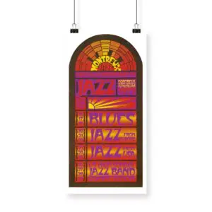
Poster Hamish Grimes, 1972
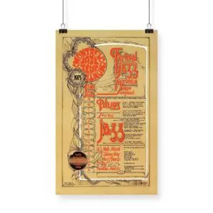
Poster Hamish Grimes, 1973